Magazine
Front Cover
For
my magazine cover, I have some rough ideas for a title/masthead. The titles I
have chosen are mostly music related and related to the genres which I have
chosen (e.g. SWAG, BASS, ENCORE). By having a solid masthead with a title that
is related to my genre, straightaway I am able to catch the attention of the
public who are interested in this genre.
In addition, I need to make the title large, bold and clear so that it
is the first thing the public/readers see.
The
image for my front cover will need to
dominate most of the page and must be eye-catching to engage with the audience.
I can further engage with the audience through the artist/model themselves by
making them look directly at the camera, which in turn gives the effect that
they are looking directly at the viewers.
Finally,
I look on using certain colours to give my magazine a consistent house style
that will run throughout. This will make my product look legit, professional
and neat. These are all aspects which can encourage the public into buying the
magazine as they know that the magazine is presented well and must contain
useful and reliable information.


Contents
Page
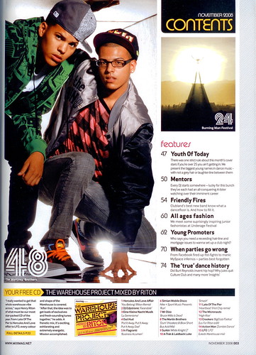
For
my contents page, I have some basic ideas on how I will structure it. Based on
my research, a professional magazine will have a consistent house style running
throughout. This means that I have to use similar colours and styles from my
front cover to the contents page. I am looking to include many pictures in the
contents page, along with a structured description of the contents and features
inside the magazine. I learned that too much writing in the contents page can
make it look untidy and rigid and therefore, I will try to minimise the amount
of writing by having a few images.
In
addition, I am looking to break the contents page into different parts and
categories to make the contents page look neat and legit. On the right-hand
side, I am looking to have a chart-like list which contains the current top 40
charts, or it could contain all of the features inside the magazine. The rest
of the contents page will have page numbers and small pictures of an artist to
symbolise how the page will be solely based around that artist. This can
encourage the readers into buying the magazine as they will recognise their
favourite artist quickly and would therefore want to find out more about them
through the magazine.

Double
Page Spread
For
my double page spread, I am looking to split the two pages into two different
parts. The first page (left/right) will be for an image only. The image will be
large and will dominate most of this page so that it can also be a poster if
cut out. This can encourage the readers into buying the magazine as they are
getting more than they bargained for as they are able to use the double page
spread as a poster.
On
the opposite page, most of the page will be filled by a quote or the title of
the article and below it, the article/interview with the artist will be
structured in a column like structure as seen in newspaper. I am looking to
also include a picture of the artist being focused on.

No comments:
Post a Comment